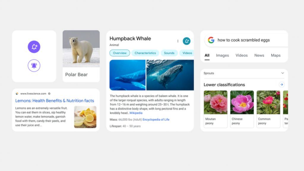
Google, on Friday, has announced a major visual redesign of its mobile search experience. It will start to roll out in the coming days for iOS and Android users. The redesigned Google search page includes larger and bolder texts, increased roundness of the search bar and icons, highlight important information using color, edge-to-edge design, and more.
“We wanted to take a step back to simplify a bit so people could find what they’re looking for faster and more easily,” said Google designer Aileen Cheng in a blog post. She added, “Rethinking the visual design for something like Search is really complex. That’s especially true given how much Google Search has evolved. We’re not just organizing the web’s information, but all the world’s information. We started with organizing web pages, but now there’s so much diversity in the types of content and information we have to help make sense of.”
According to the blog, there are five main aspects of the redesign, including bringing information into focus, making text easier to read, creating more breathing room, using color to highlight what’s important, and leaning into that “Googley” feeling. “We want to let the search results shine, allowing people to focus on the information instead of the design elements around it,” says Google designer Aileen.
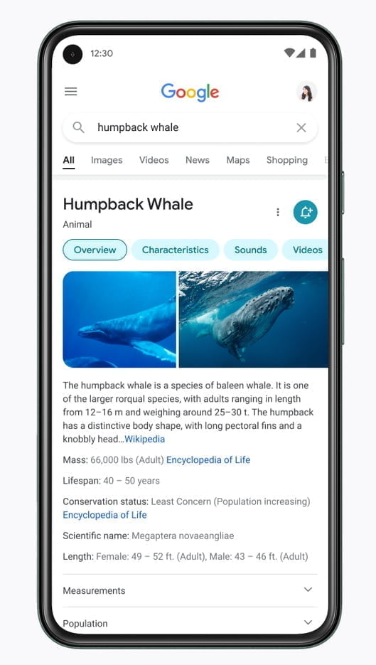
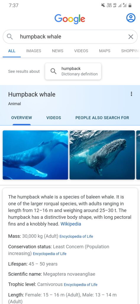
The redesigned search comes with larger and bolder texts along with the bigger result and section titles so that the users can scan and understand search results faster. Google’s design team has created a new edge-to-edge results design with minimal use of the shadows to allow more visual space for the search results and other contents. Google will also use colors more intentionally to highlight important content and images to bring focus.
The Google team is borrowing the roundness from the Google logo and bringing it to other places, including the search bar and icons. “If you look at the Google logo, you’ll notice there’s a lot of roundness to it, so we’re borrowing from that and bringing it to other places as well. You’ll see that in parts of this redesign, like in rounded icons and imagery. That form is already so much a part of our DNA. Just look at the Search bar or the magnifying glass,” says Aileen.