Google kicked off its annual developer event, Google I/O on Tuesday. While we had announcements covering nearly every single Google product, some portion of the keynote was hogged by Android 12 – the next iteration of Google’s smartphone OS.
Design Changes
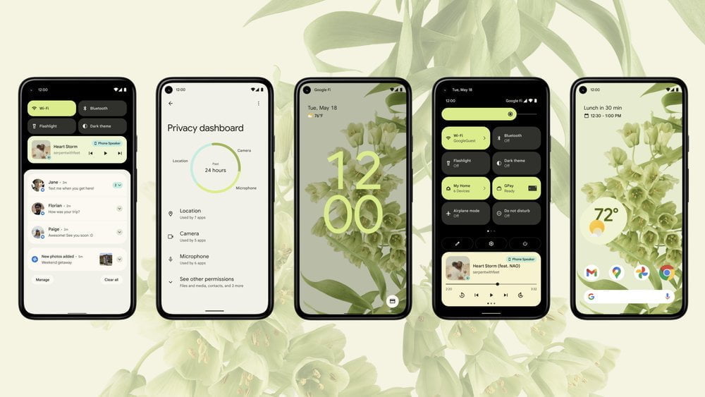
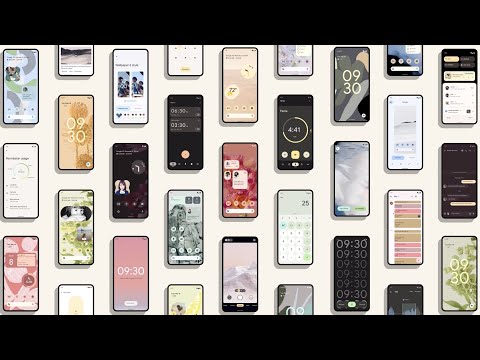
This is one of the most significant updates to the Android UI. During the keynote announcement, Google revealed that Android 12 will have a radically new design based on a system called “Material You” – the biggest redesign to Google’s Material Design since Android 5.0 came with it in 2014.
Quick Settings Revamp, Customisation and Theming
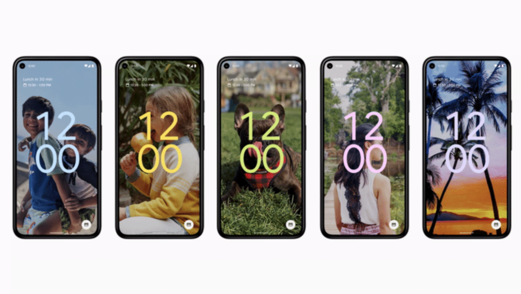
Google developed a new theming engine for Android 12 that extracts the colours from your phone’s wallpaper and applies them to the OS inside widgets, quick settings toggles, lock screen and many other places as well. The system identifies both primary and complementary colours of the wallpaper to apply. You can also customise with your own colours as well, if you’re not happy with the default selection. While this isn’t available with the Android 12 Beta 1 that released today, it will be available in one of the upcoming Betas, closer to the actual launch
With Beta 1, you will currently get the same amount of customisation you will find on Android 11. You can choose from a select number of pre-determined accent colours in the Styles & Wallpapers settings. Nothing is applied from your current wallpaper as of writing. Android 12 will also introduce new widgets and a new home screen layout, which will be available in a later Beta release.
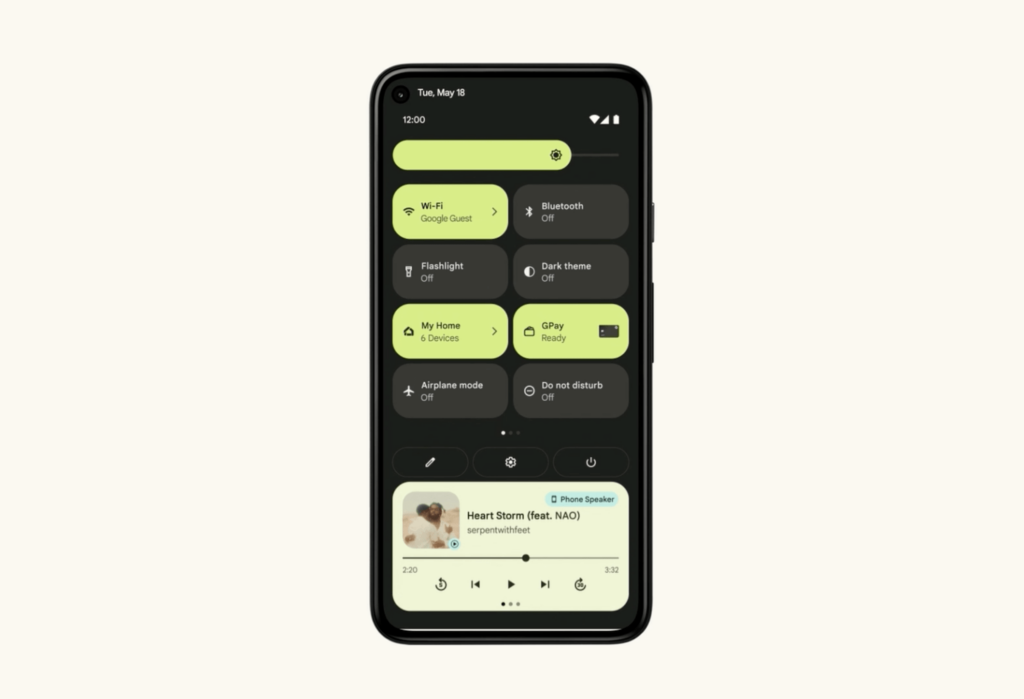
There has been a massive overhaul to the quick settings panel on Android 12, which you can see from the GIF above. The brightness slider is now thicker, making it easier to use. The round quick settings buttons are now replaced by long, rectangular button containing the respective setting icon along with some description if not in use, otherwise it will be replaced by the status of that particular setting when in use.
The layout has also changed massively. In Android 11, we used to get Six Quick Settings buttons with the first pulldown of notification shade, along with an expanded view of the other quick settings spread across multiple columns. In Android 12, the first pulldown only shows 4 quick settings on the first pull along two columns and on the second pull down, it shows only a total of eight quick settings icons across two columns, with each toggle being bigger. This should address concerns from people who say the quick setting icons were far too short.
Along with the expanded view, you will now see three buttons below the quick settings toggles. The first one is to edit the Quick Settings Layout, the second one to open the Settings screen and the third one is to show the power menu. The third one will show you the menu you would see when you long press the power button of your phone. If you ask why this change is being made, it’s because the long-press power button functionality will now trigger the Google Assistant – something which no one asked for. This will be a massive change for many users to digest, and thankfully we will have an option in Settings to turn it off. Luckily the Beta 1 doesn’t feature this by default yet, but it will in a later release.
New Lock Screen and Always-On Display
Android 12 is bringing the first major update to the Lock Screen and Always-On Display, which has usually remained unchanged with new Android releases. Upto Android 11, you would see a static clock displaying the current time, along with Weather info right below it. Below that you would see Notifications and at the bottom edge, you would see Battery and Current Charging status.

With Android 12, the clock takes up a big part of the lock screen, if there are no notifications, with the default clock style looking very similar to what you will find on Sony Xperia phones. When there are notifications popping in, the clock moves to the top left of the screen, along with the weather info and date. There are also so many new animations throughout Android. The best one would be the lock screen transition. If you wake the screen by pressing your phone’s power button, the display will light up, starting at the power button. If you put your screen to sleep with the power button, the display will fade into the power button.
Android 12 also features a redesigned PIN entry screen. The numbers are now within accentuated circles, and the PIN entry screen takes up the entire screen and does not show the phone’s background while entering, just the accent colour.
Privacy Dashboard and Improved Permissions
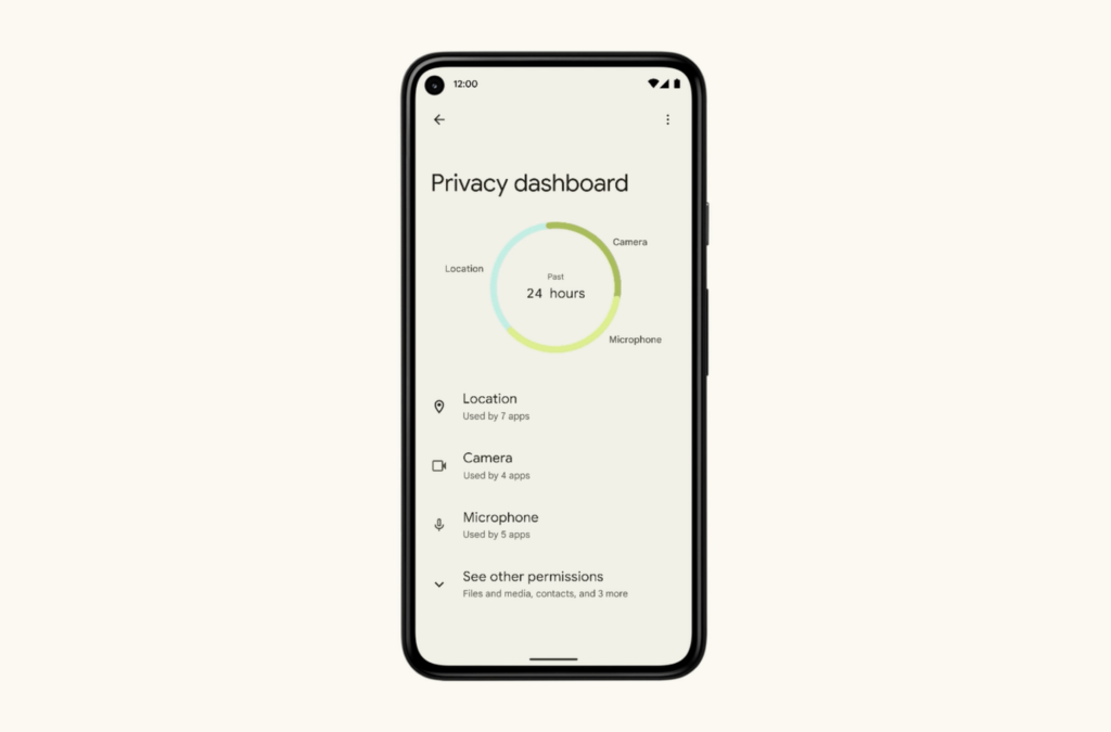
Android 12 is getting a new Privacy Dashboard section in the settings screen. Just like how Digital Wellbeing shows you how many times you accessed an app in a day, the Privacy Dashboard screen shows you how apps access each of your permissions in a day. As an example, if you want to see which apps have used your location, the Privacy Dashboard will show you a complete timeline showing which apps accessed your location along with the time at which it was accessed. From there, you can revoke access to a specific app as per your liking. It doesn’t have app limitations, either – all applications will be tracked by the Privacy Dashboard.

Along with this, Android 12 will now show a green pill at the top when your phone’s camera and/or microphone is being accessed. Clicking on the pill further will highlight the apps using the camera or microphone. If you don’t like what you see, you can disable the access to camera and microphone through the new quick settings toggle for these. Keeping those toggles off would mean that not even the system apps can access these sensors. If you want to use your camera or microphone, you need to keep the respective toggle in quick settings on.
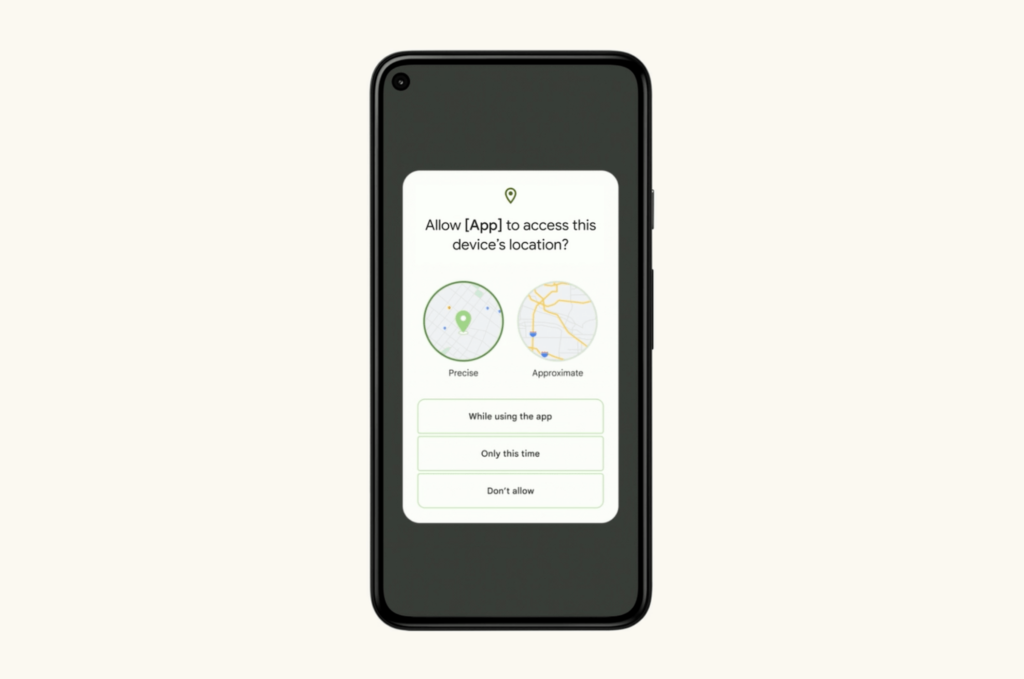
There’s another useful change with Android 12 that if you don’t want apps to access your precise location, you can now provide the app with an approximate location instead. You can configure this location setting per app either inside the App page inside Phone Settings or when the app asks you for the location permission.
Private Compute Core
Talking about Privacy, Android 12 now has a dedicated space within the OS for performing Machine Learning tasks locally on your phone. Android’s new Private Compute Core will hold data for use in machine learning, like the data used for providing Live Captions based on audio, Smart Reply which suggests short responses to messages and emails or the Now Playing feature which tells you the song that’s playing.
“This means that all sensitive audio and language processing happens exclusively on your device and isolated from the network to preserve your privacy,” Google explained in a post announcing the feature. Like the rest of the Android components, the new feature will be open-source and subject to security auditing.

