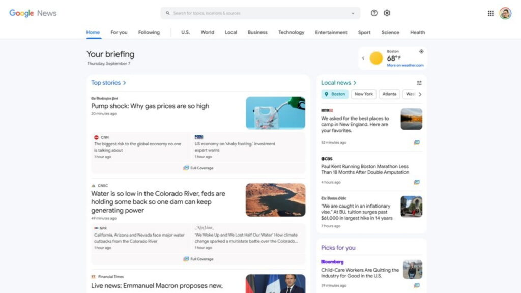
Tech giant Google has launched the redesigned Google News on Desktop with some new features to mark its 20th anniversary. Now, the webpage gives more importance to local and personalized news content.
Previously, the headlines section was placed on the top along with the weather widget on the side while other news categories like World, For You, and Local news were shown below or by selecting these topics from the sidebar.

Now, the news categories are moved from the left-hand side of the screen to a menu bar at the top of the page for easier accessibility. The Top Stories tab is accompanied by a Local stories tab on its side and the weather widget now takes up a small space on the top right of the screen.
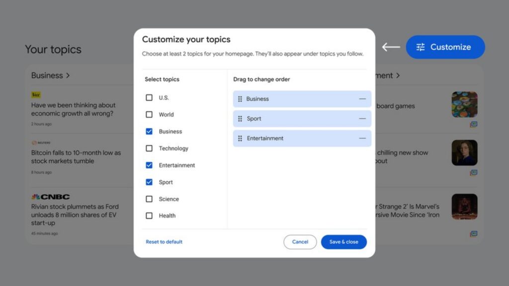
Customisation is also added with this update. Users can tap on the customize button next to the Your topics section to select the topics they are interested in and Google will show News from these topics on the home screen. The order of appearance of news categories can also be modified.

The Fact Section too got a makeover and it now clearly highlights the original false claim and verified assessment by reputed organizations with more details about the story.
In a blog post, the company said, “Our new look for Google News on desktop was inspired by feedback we received from readers. We’ve made it easier for you to catch up on the most important news by bringing Top stories, Local news and personalized picks for you to the top of the page.”


60 replies
Loading new replies...
Join the full discussion at the OnlyTech Forums →