It was just yesterday that Vodafone Idea unveiled its fresh unified brand identity Vi and within 24 hours we have witnessed a complete makeover of their consumer contact centers (Vodafone stores) in select locations. OnlyTech was able to get access to one such Vi Store situated in a prime location in south Mumbai. We will be walking you through, so you can experience the new look first hand through the images.
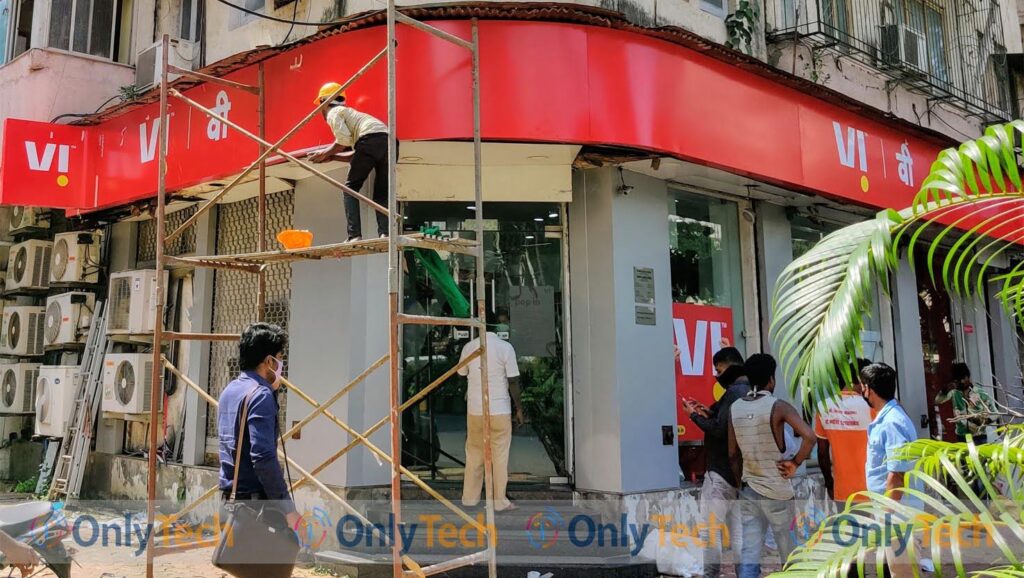
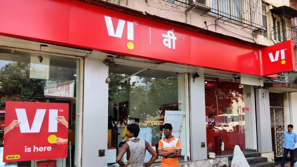
The external board re-branding was still underway when we visited. The Vi brand logo with the iconic inverted i and yellow dot over the red backdrop. Poster on the glass window reads ‘Vi is here, walk-in’. To the right is the entrance to the self-service automated kiosk for bill payments.
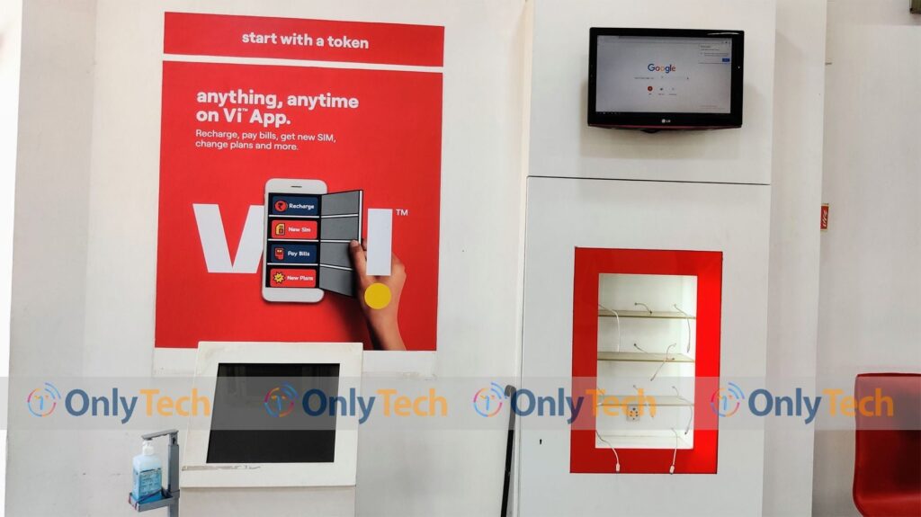
Inside the store, just beyond the entrance is the token vending machine along with a hand sanitiser dispenser. A poster above it advertises the newly revamped Vi app (Formerly My Vodafone App).
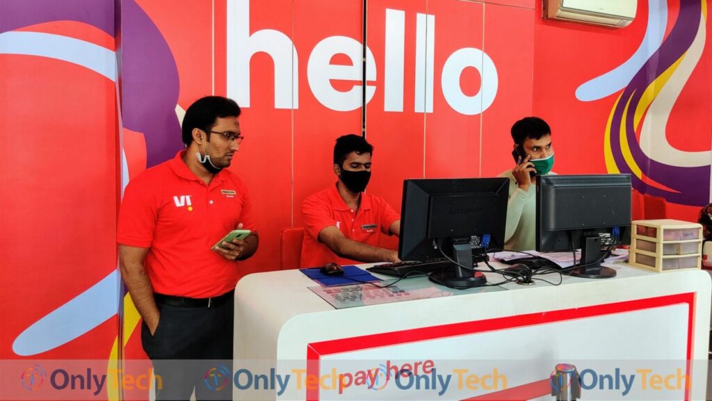
The main billing desk for payments, with the new art-form in the backdrop. Executives wearing the Vi branded red t-shirts.
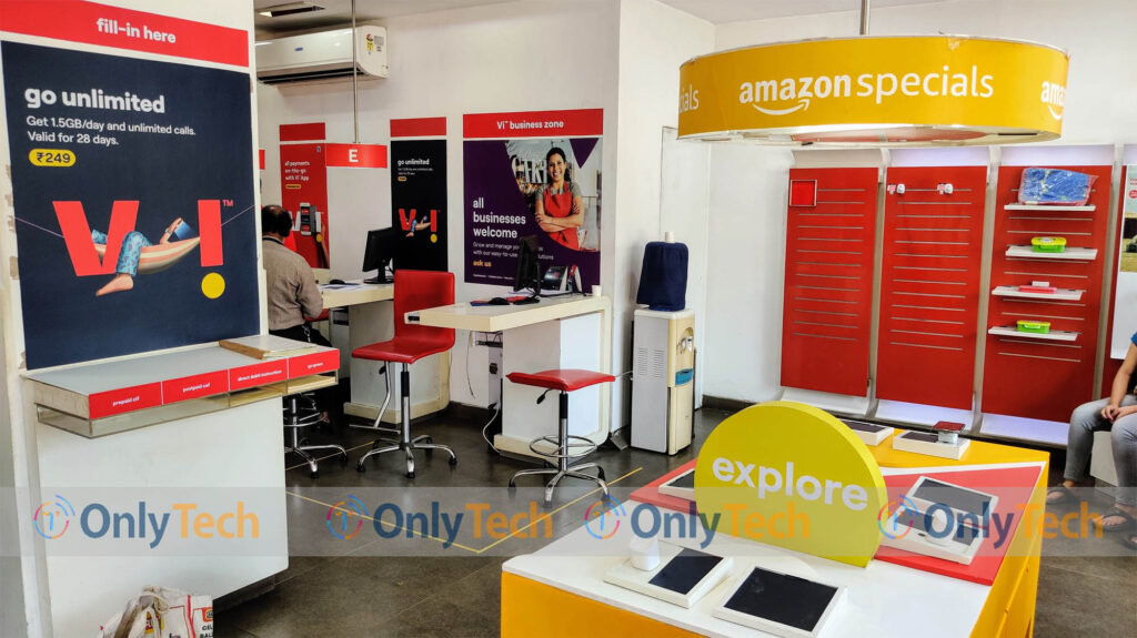
Form filling table to the left with the poster showcasing the Rs 249 unlimited plan. To the right is the Amazon branded experience kiosk.
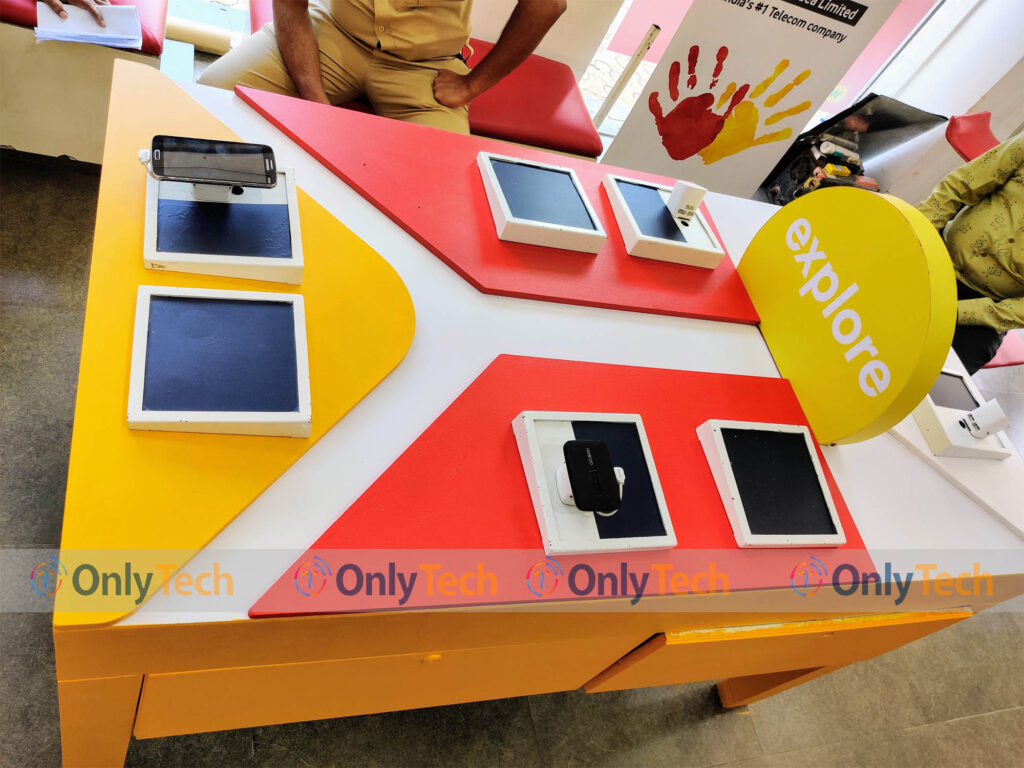
Top view of the experience kiosk to get first hand interaction with smartphones and tabs and demo of Vi products and services.
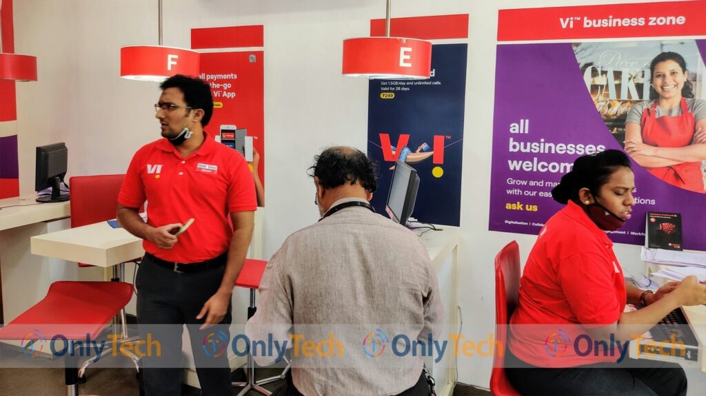
Vi business zone for information and support on Vi’s enterprise solutions for small and medium business setups.
This is how the Vodafone store has metamorphosed into Vi store and is up and about with its routine business. It remains to be seen whether the brand refresh proves fruitful in changing the the operator’s perception among the subscribers and helps it turn profitable again.



Nice way to cheat the people.
Looting b______s 😠😠😠😠😠