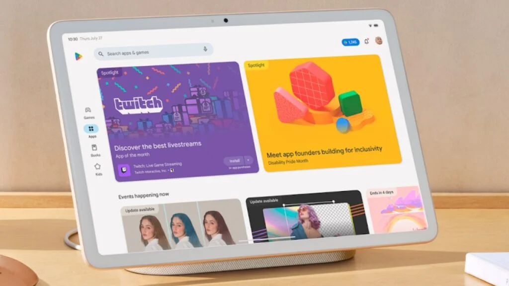
Google is introducing a new redesigned Play Store with enhancements for improved user experience on larger devices, including Chromebooks, Android tablets, and Android foldables. The company is bringing four major updates to the Play Store that aims to help users easily find high-quality large-screen apps. The updates include refreshed app listing pages, ranking and quality improvements, streamlined store navigation, and a split-screen search experience.
Refreshed app listing pages for high-quality apps
Google has revamped the app listing pages to improve the user experience on larger devices. To provide users with a better understanding of the gameplay, games with high-quality videos will now display a video banner on top of their app listing page. Further, the apps and games details page has been reworked in a multi-column layout to display more content on the screen.
Ranking and quality improvements
In order to provide apps and games that work better on large screens, Google has made several ranking changes to improve quality across the Play Store. Apps and games that follow the large screen app quality guidelines will now rank higher in the search and Apps and Games Home. Google says this will help users to find apps that fit well on large screens with support for both portrait and landscape orientations and are not letterboxed. Moreover, Editors’ Choice, other curated collections, and articles will also feature apps and games that are optimized for larger screens.
Google is expanding its app listing warnings and reduced visibility for apps and games that do not meet Play’s per-device technical quality bar to larger devices. Warnings will appear on the details page for apps and games with an 8-percent user-perceived crash rate or 8-percent user-perceived ANR rate. The company will roll out these changes in late August to allow developers to monitor apps in the Play Console or reporting API to improve their app’s stability and performance.
Streamlined store navigation
Google has moved the navigation rail to the left side of the screen to simplify the navigation on the Play Store on larger devices. According to Google, putting the navigation rail to the left side brings the menu items closer to the users’ thumb, making it more accessible while holding the device in landscape mode. Additionally, Google has moved the Top Charts and Categories sections to Apps and Games Home. On tablets and Chromebooks, the company has made the Kids experience a primary tab.
Split-screen search
Google is launching a new search experience on the Play Store to make it easier for users to discover and compare apps right from the search results page. “We’re launching a split-screen search experience on large screens, displaying search results and app details pages side by side. This prevents users from switching back and forth when exploring new apps and streamlines the discovery process,” the company said in a blog post.
Google will start to roll out these changes over the coming weeks which will enhance the Play Store experience on larger devices.


745 replies
Loading new replies...
Join the full discussion at the OnlyTech Forums →