Wikipedia, one of the most visited sites in the world has received its first facelift in over a decade. The Wikimedia foundation – which runs Wikipedia and other related projects – announced the launch of an updated interface aimed at making the site more accessible and easy to use, featuring an improved search experience, easier switching between languages for a wiki page, an updated table of contents section and a lot more.
The revamped desktop interface comes at a time when English Wikipedia celebrated the completion of its 22nd year on January 15. The interface had been rolling out to other regional Wiki websites over the past several weeks, and this is now live on the English version as well, thereby making this revamp operational on 94% of the 300+ various language versions of Wikipedia.
While the site might look a bit different, the changes don’t overhaul the site completely. In fact, many casual readers may not be able to notice these changes immediately. The foundation states that introducing this new look was necessary to meet the needs of the next generation of internet users, including those who are more newly coming online and may have less familiarity with the internet.
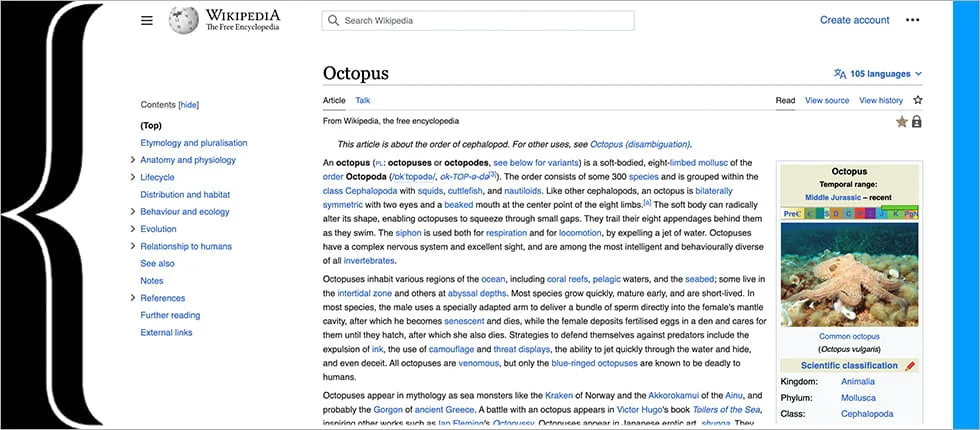
The most obvious change is that the logo at the top left has now become a lot smaller than it was previously. The Article and Talk tabs have now moved underneath the article header. When searching, users will also see a tiny example of the article’s main image, which is almost useless as most users won’t be able to tell what they’re looking at, even if they pixel peep at it.
Along with these, there are a few more features that make the main page slightly more customizable. There’s a new collapsible table of contents which instantly scrolls to different sections of an article. This table is stickied on the left side of the page and will update dynamically when the user scrolls through the article. This sidebar is also collapsible, and it can help if you want to remove distractions and have more screen area for the wiki article. The site now has a smaller maximum text width and a larger default font size.
“The changes make it easier for people to find and learn from the work of our incredible volunteers. These features were created with feedback from readers and volunteers from all over the world, aiming to meet the needs of our increasingly diverse audience, while keeping the simple and straightforward feel that millions of people have come to trust over the last 22 years.”
Selena Deckelmann, Chief Product and Technology Officer at the Wikimedia Foundation.
Wikimedia mentions that the updated Wikipedia UI for desktop devices does not remove any previous functionality. It instead introduces new tools to improve the existing website experience through enhancements based on consultation with Wikipedia volunteer editors, data analysis, and user testing. They had talked about this revamp back in 2020, but developers have taken their own time to introduce these features to the smaller wikis. Despite not having many updates over the years, Wikipedia has been one of the most visited websites and its articles are viewed billions of times every month.
10 replies
Loading new replies...
Join the full discussion at the OnlyTech Forums →