If you are reading this, you might have already noticed a fresh and revamped design on our website. We are extremely happy to present the new design of our OnlyTech website to you. We now sport a very futuristic and lightweight user interface that would fulfil the needs of our readers in every way and, at the same time, remain fast and smooth for a better browsing experience. Let us briefly look at this makeover’s new and revamped features.
The Homepage
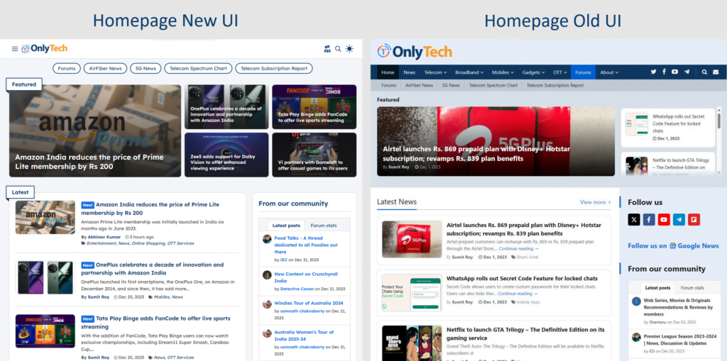
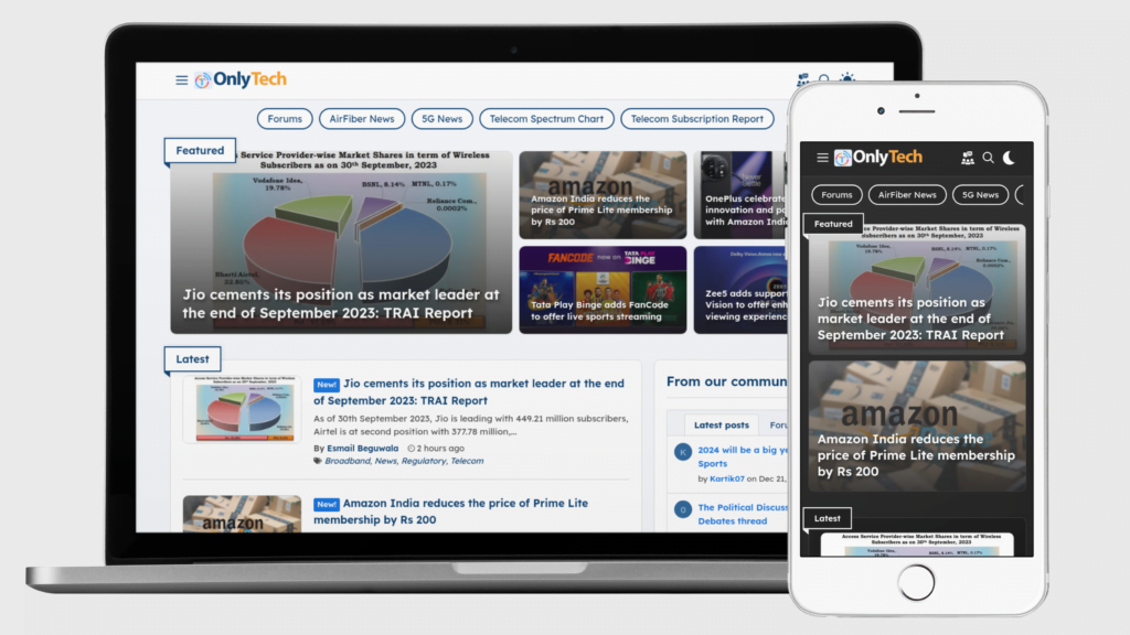
Our homepage layout has changed from a traditional pyramid layout to a modern layout containing only minimal elements. The homepage now consists of two prominent elements, Featured and Latest blocks displaying the articles.
Featured block
The Featured block is now changed into a tile layout, from the previous scroll layout, which will display five prominent articles on the desktop layout. It will feature four prominent articles on the tablet layout and two on the mobile layout.
Latest block
The Latest block lists all recently published articles in reverse chronological order. It has a numerical pagination to navigate through the contents.
Dark mode
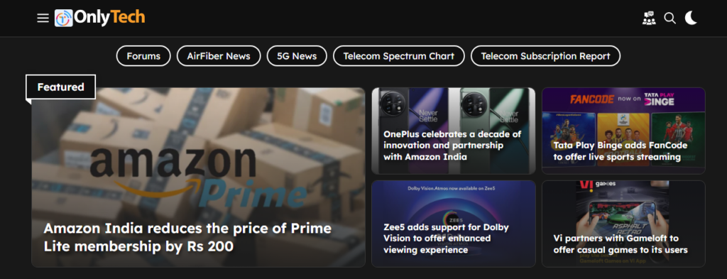
This is the most awaited feature in our new interface. Many of our readers were looking for native dark mode functionality support on our website, and they can rejoice now. We have introduced a sleek dark mode toggle at the top right corner, which can either follow your OS color-mode selection or manually set it to match your liking. You will like its cool animation too.
Navigation system
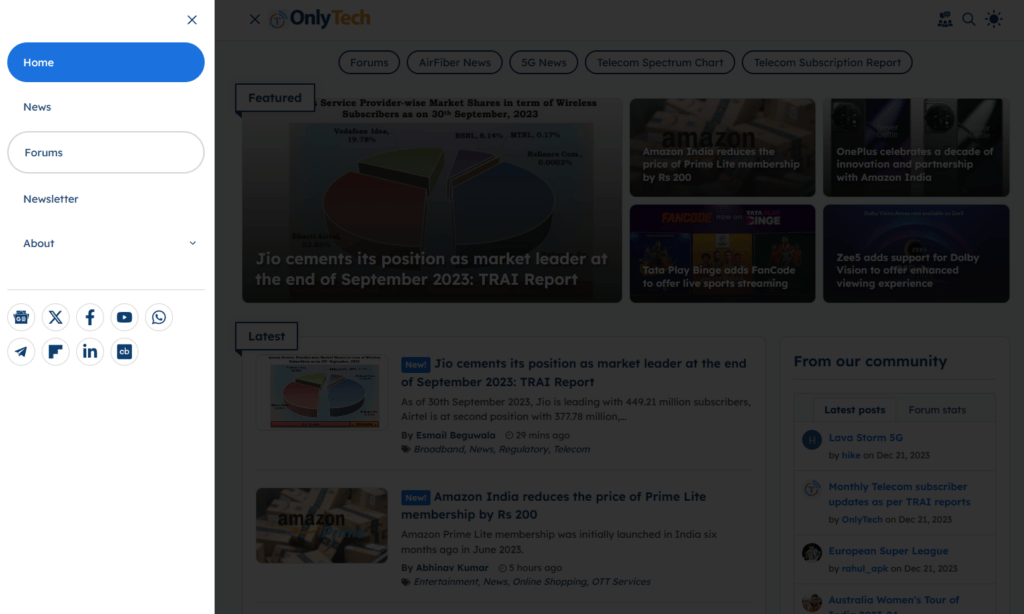
We have totally reworked our navigation menu system. Now, the navigation menu features the same off-canvas menu drawer navigation layout across desktop, tablet and mobile devices for uniformity and easy accessibility.
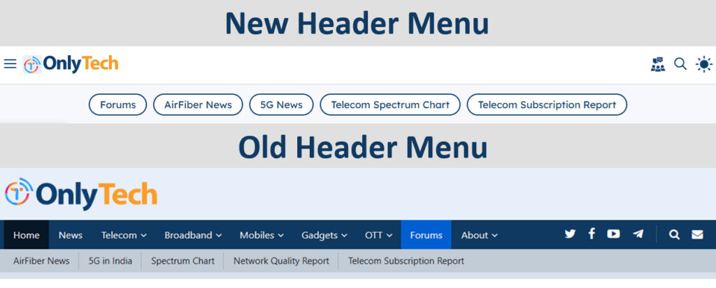
The new header navigation menu contains a hamburger menu icon on the left side to open the off-canvas menu drawer. The new header navigation bar now sticks across the page and is even accessible when you scroll down. To improve the reading experience on small screen devices, we hide the sticky navigation when you scroll up the page.
Our community forums can now be reached just by clicking the new community icon available on the top right. There is also a search and dark mode icon beside it.
Primary Navigation
As explained above, we have removed the long menu links from the desktop header menu layout and have put all the necessary links you might need to navigate our site under the off-canvas menu drawer. The social icons that were earlier placed next to the menu on the header have also been moved inside this hamburger slide-out menu. This is to give our readers a clean experience with no distractions on the header.
Secondary Navigation
The secondary navigation menu bar had some medium-priority site links. Since this secondary menu bar took up some extra space on the header, we have now limited its visibility to the homepage and category pages; it will be auto-hidden on the article page.
Article page layout
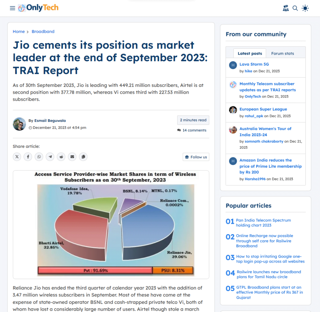
The article viewing page has a refreshing change in its layout. The author’s by-line and the reading time have been given distinct visibility, and the article-sharing options are now available at the top and bottom of the article. Those sharing icons will sport their proprietary colours when hovering the mouse over them.
Author box
The author details at the bottom of the article will now feature the number of articles an author has published on our website. The number of social media accounts an author can link to his profile has also increased and now supports a broader range of websites, including Threads, Instagram and Mastodon.

Mobile-ready, responsive web design
We already had a responsive design on our website in the past, but this new redesign is made considering the increased number of readers who visit us using mobile devices. Every block on any of the pages on our website will now adapt to the device you are using, giving you a seamless experience.
Miscellaneous improvements
Subscribe to Newsletter
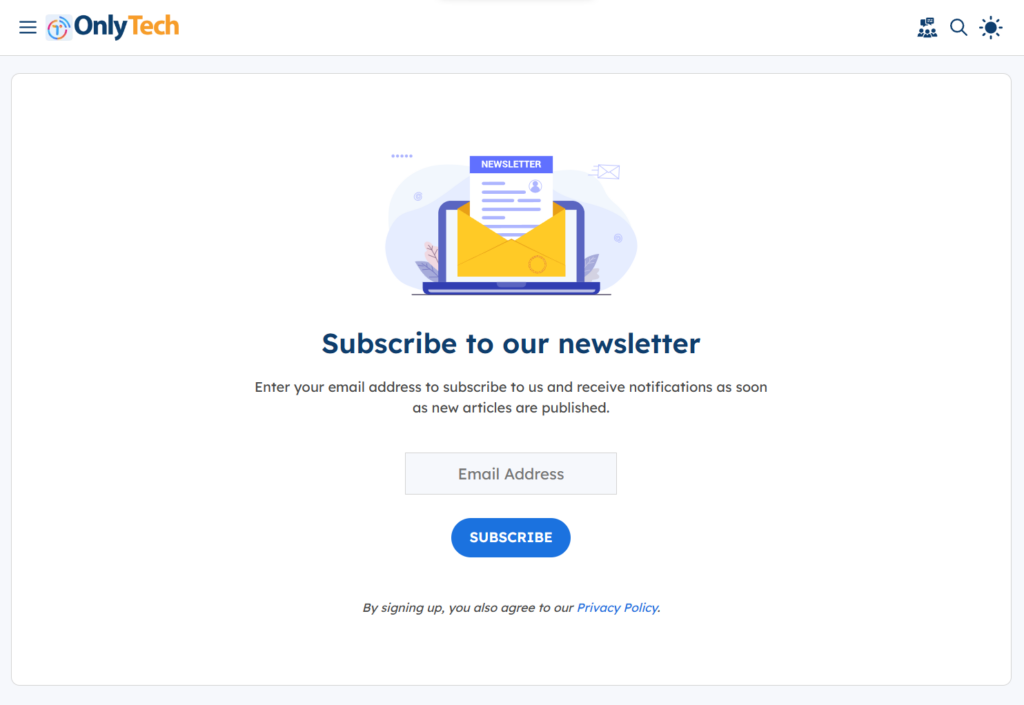
Subscribing to our Newsletter can’t get better with our new redesigned and dedicated page. Our new dedicated newsletter page gives you more information while subscribing to our newsletters.
Search
The search icon, search bar and its functionality have all had a complete makeover. The search functionality now has a modern modal popup view, and its functionality also improved which will fetch you results with more accuracy.
Font
We have a new font that blends well with our design, looks more modern, and aids ease of reading.
Bugs? Ping Us.
Enjoying our revamped design? We’d love your help! While we tried our best to provide you with a refreshing browsing experience with this new redesign, there might be some bugs that we might have missed to notice. If you’re an eagle-eyed person who loves finding needles in haystacks, please let us know anything that looks off. Share your findings in the comments section of this article or through the contact us page.
We hope this redesign can provide pivotal support to OnlyTech’s future. We hope you like the new features and the improved user experience. We’d love to hear your feedback and suggestions. Please let us know your thoughts in the comments below!


No replies yet
Loading new replies...
Join the full discussion at the OnlyTech Forums →