JioCinema is a subscription video-on-demand and over-the-top streaming service owned by Jio Platforms, a subsidiary of Reliance Industries. With an app update today, Jio has quietly rolled out a major overhaul to the user interface of the JioCinema app, on both Android and iOS.
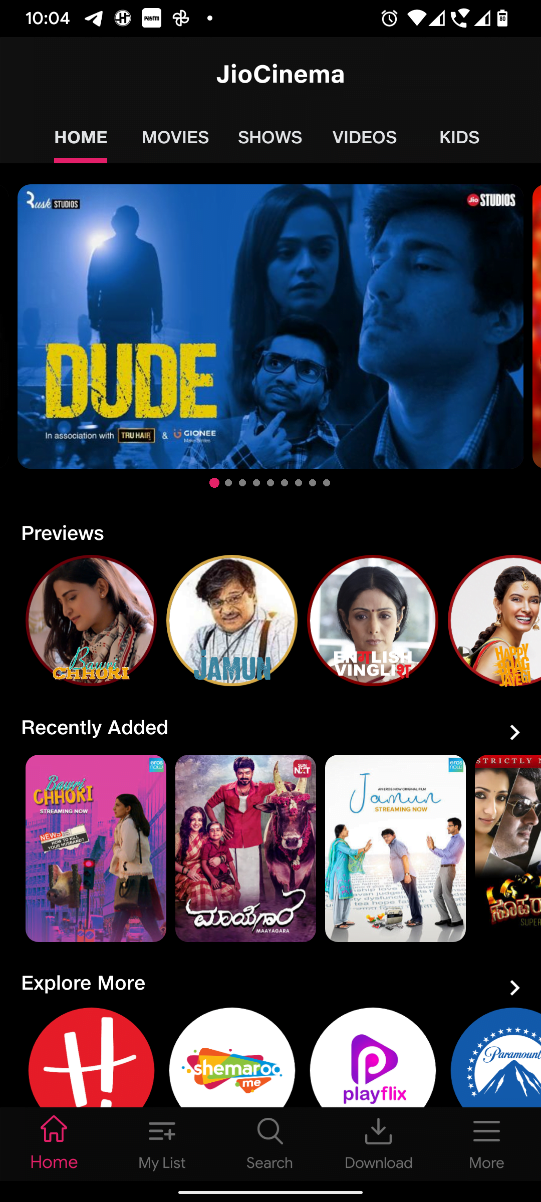
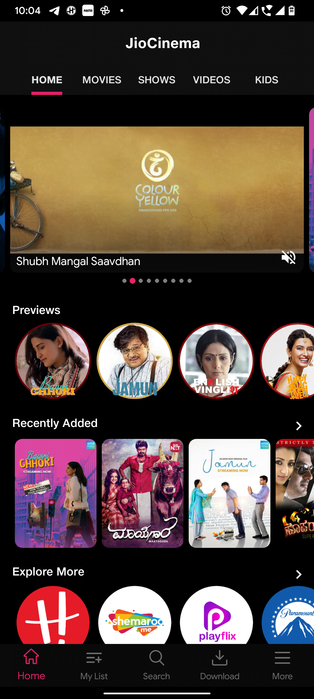
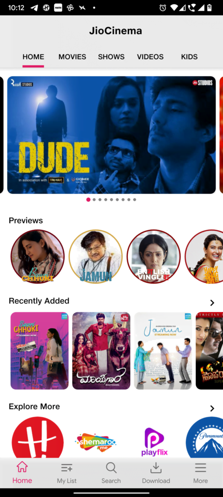
First up, the look of the home screen has now changed. Earlier, tabs like Home, Movies, Shows, Videos and Kids used to be present as a Bottom navigation bar. It’s now moved up to the top, right below the JioCinema title. Now the content carousel in the Home Screen plays the trailer of the content by default. There is no change to the content player screen. You can still swipe it down to minimise it to the bottom-right corner, and then swipe the video left or right to dismiss it, just like how you could do in YouTube sometime back.
Another big noticeable difference is that the app’s drawer is no more. My List and Download buttons present in the app drawer have now moved to the Bottom Navigation bar. The Search button which used to be present earlier alongside the JioCinema title has also moved to the Bottom Navigation bar.
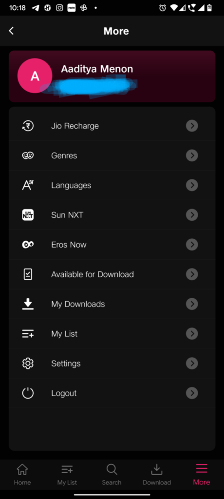
The other options which were earlier present in the app drawer like Genres, Languages and Settings have now moved to the More button, which is also present in the Bottom Navigation bar. New options like Sun NXT and Eros Now have also been added to the More screen.
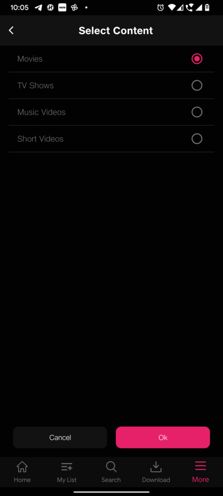
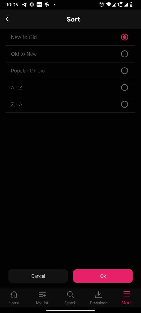
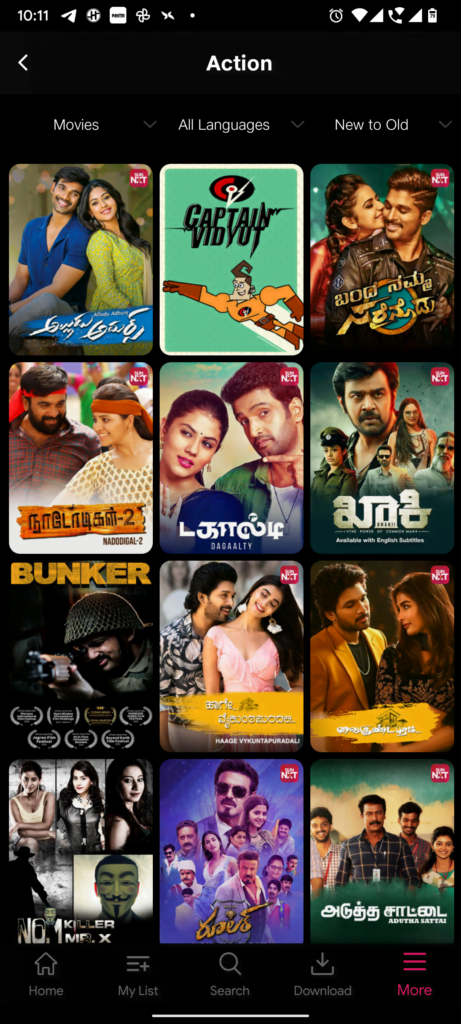
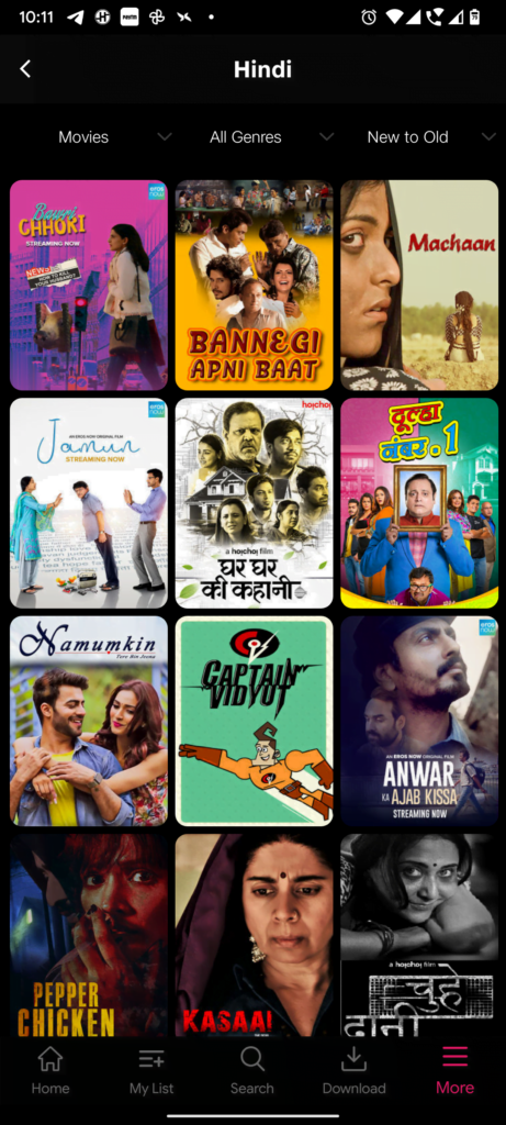
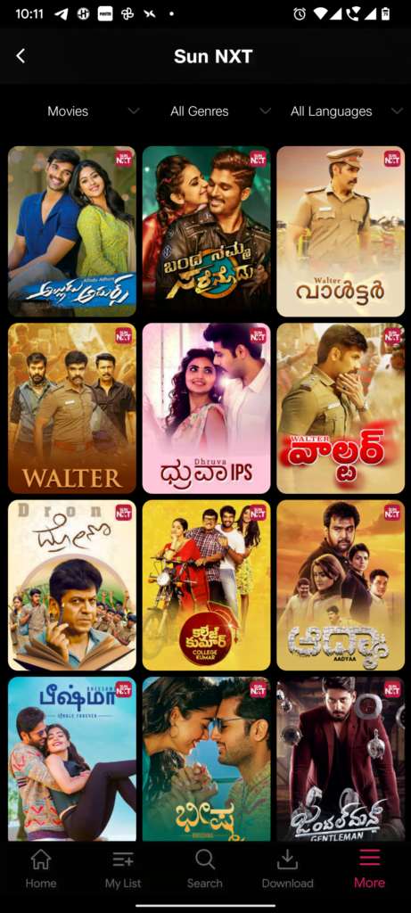
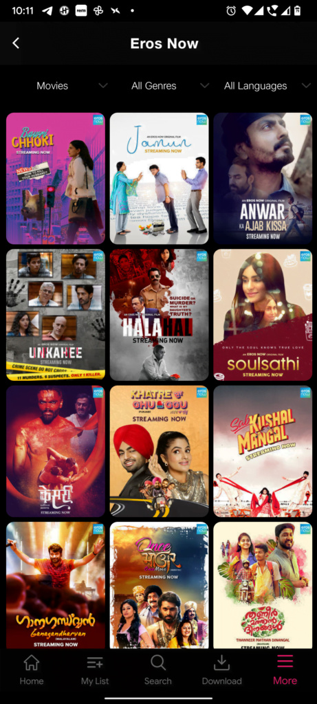
It is also possible to filter contents in the Genres, Languages, Sun NXT and Eros Now Screens out of three possible options. We can now select content type out of Movies, TV Shows, Music Videos and Short Videos. In the Genres and Languages screens, we can also select the sorting order in these screens out of New to Old, Old to New, A – Z, Z – A and Popular on Jio as well as select the Language in the Genres screen or select the Genre in the Languages screen. Whereas in the Sun NXT and Eros Now screens, the sort option is replaced by the option to select both the Genre and the Language.
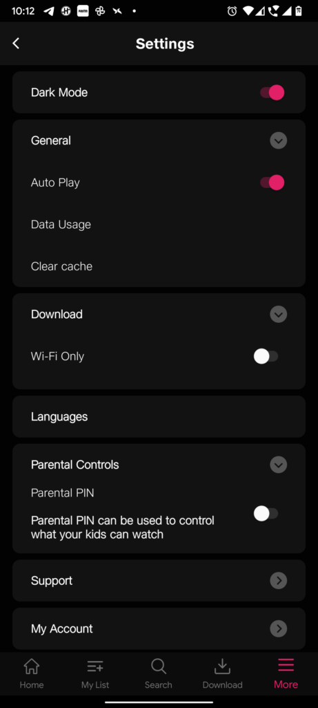
The Settings screen also finally brings an option to change the App’s theme to Dark or Light, based on the Dark Mode switch.
While there are big improvements overall, the only flaw we could point out so far is that if you move away from the Home in the Bottom Navigation bar to some other option there, and then come back to the Home screen, it ends up reloading the entire Home tab contents again – akin to refreshing a website. Thankfully, this behaviour is not seen for the minimised content player, which persists its state across each of the navigation options.
While we were only able to spot these changes, if you have spotted more changes to the app, do let us know in the comments below.


No replies yet
Loading new replies...
Join the full discussion at the OnlyTech Forums →