It wasn’t long after the thinner, lighter, better Galaxy Tab 10.1 was announced that we heard Samsung would bring its TouchWiz skin to Android’s tablet OS, Honeycomb. After much debate over whether Honeycomb was truly ‘open,’ and not a closed iOS like environment, here we are. Starting today, Samsung Galaxy Tab 10.1 owners will start to see OTA updates pushed to their devices, offering the first skinned Honeycomb experience. We’ve got it now, and this is more than just a few widgets. Was it worth the wait, or will users avoid this optional update as long as they can?
Skins are Evil/Great
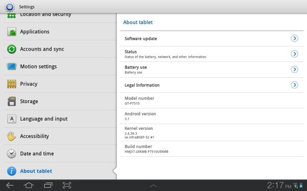
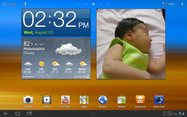
Let’s go over a few things that this update is not. This update is not Android 3.2; however, we did receive assurances that the heavy lifting for TouchWiz has already been done so there should be no delay in rolling out 3.2 and it’s graphics and UI enhancements. This update is not a cure for all the bugs that continue to ail Honeycomb; the occasional sluggishness and random Force Close events persist. This update is not a lag inducing crime against Android users; any enhancement that burdens the CPU or GPU at all will inherently result in some worsening lag, either in the UI or in opening, closing or using apps. But the lag we’ve seen is nothing too jarring, nor is it so far off from what’s normally found on Honeycomb. So, what is this update? Samsung described three key areas they wanted to enhance with what’s known now as TouchWiz UX; Ease of Use, Fun and Entertainment, Open for Business. By far, the most outward of these enhancements is Ease of Use, so we will start there.
Widgets and Apps
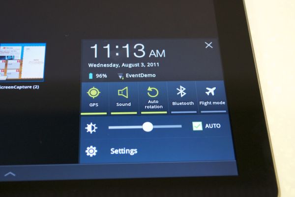
TouchWiz introduces three major enhancements, LivePanels, MiniApps and the Quick Panel. The last is the simplest of the lot and the easiest to dispense with; the same set of toggles we’ve seen stuffed into most skinned UI’s on Android is now present within the Notification shade, allowing users to manipulate all the devices radios, volume, screen brightness and vibrate functions with just a press. Hardly revolutionary but a good way to bring up some settings that were previously buried in menus.
The MiniApps may be one of the more compelling additions. Tucked in a hidden OS X style dock are six applications that are unique and redundant at once. The applications are a task manager, calculator, calendar, world clock, music player and finger or stylus driven memo pad. None of these apps are terribly novel but they are each blessed with something not seen in Android yet. When the app is pulled up it appears as an overlay atop the screen, any apps previously on the screen will remain open below the MiniApp. The app will then remain overlaid until closed manually, meaning you can continue working on other apps and even change home screens and the MiniApp will be there, it even takes on a transparency affect when focus is moved from it so you can see what’s behind it.
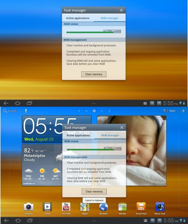
The best use case for MiniApps is writing in the memo app. On a PC it’s easy to keep a text window open along side or over a browser window opened to a relevant item and switch between them. Previously on smartphones and tablets this sort of work flow was dreadful because of the jarring and often slow transition from one app to the next and back. This enhancement solves this problem for these six apps. If you have little use for any of these apps (certainly the World Clock’s utility is beyond me) then you’ll have little use for MiniApps; we’re inquiring whether this technique will be accessible to devs and eventually grant the ability to add or delete apps from the Dock bar.
more...

Skins are Evil/Great

Let’s go over a few things that this update is not. This update is not Android 3.2; however, we did receive assurances that the heavy lifting for TouchWiz has already been done so there should be no delay in rolling out 3.2 and it’s graphics and UI enhancements. This update is not a cure for all the bugs that continue to ail Honeycomb; the occasional sluggishness and random Force Close events persist. This update is not a lag inducing crime against Android users; any enhancement that burdens the CPU or GPU at all will inherently result in some worsening lag, either in the UI or in opening, closing or using apps. But the lag we’ve seen is nothing too jarring, nor is it so far off from what’s normally found on Honeycomb. So, what is this update? Samsung described three key areas they wanted to enhance with what’s known now as TouchWiz UX; Ease of Use, Fun and Entertainment, Open for Business. By far, the most outward of these enhancements is Ease of Use, so we will start there.
Widgets and Apps
TouchWiz introduces three major enhancements, LivePanels, MiniApps and the Quick Panel. The last is the simplest of the lot and the easiest to dispense with; the same set of toggles we’ve seen stuffed into most skinned UI’s on Android is now present within the Notification shade, allowing users to manipulate all the devices radios, volume, screen brightness and vibrate functions with just a press. Hardly revolutionary but a good way to bring up some settings that were previously buried in menus.

The MiniApps may be one of the more compelling additions. Tucked in a hidden OS X style dock are six applications that are unique and redundant at once. The applications are a task manager, calculator, calendar, world clock, music player and finger or stylus driven memo pad. None of these apps are terribly novel but they are each blessed with something not seen in Android yet. When the app is pulled up it appears as an overlay atop the screen, any apps previously on the screen will remain open below the MiniApp. The app will then remain overlaid until closed manually, meaning you can continue working on other apps and even change home screens and the MiniApp will be there, it even takes on a transparency affect when focus is moved from it so you can see what’s behind it.

The best use case for MiniApps is writing in the memo app. On a PC it’s easy to keep a text window open along side or over a browser window opened to a relevant item and switch between them. Previously on smartphones and tablets this sort of work flow was dreadful because of the jarring and often slow transition from one app to the next and back. This enhancement solves this problem for these six apps. If you have little use for any of these apps (certainly the World Clock’s utility is beyond me) then you’ll have little use for MiniApps; we’re inquiring whether this technique will be accessible to devs and eventually grant the ability to add or delete apps from the Dock bar.
more...
