Raviteja
Contributor
- Joined
- 26 Mar 2012
- Messages
- 1,948
- Reaction score
- 1,743
Google has officially launched the new web version of the Play Store, and it's a looker. The new interface is based around - you might have guessed - cards and sidebar navigation. I can't find a single page that hasn't been completely revamped. The new look is quite attractive, I think, and presents information in a much more clean, readable manner.
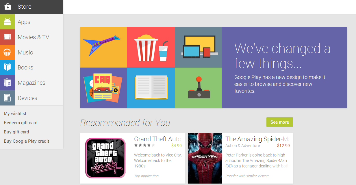
While functionally there aren't a huge amount of changes, the visual difference is stark. Everything seems to flow naturally as one big page as you navigate around the store, as opposed to a bunch of individually loading pages. The result is that most pages on the Play Store now load much more quickly than they did on the old site (well, at least for us they do - your mileage may vary).
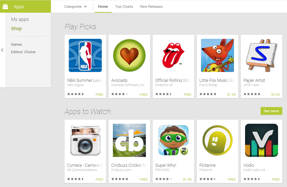
New features include full-sized screenshots for apps (screenshots are also now in WEBP format), and the ability to wishlist directly from the web store. The individual app pages are sporting an all new look that, while it requires more scrolling, is much easier to visually parse, and logically groups information into sections, rather than a bunch of columns and annoying varieties of font size.
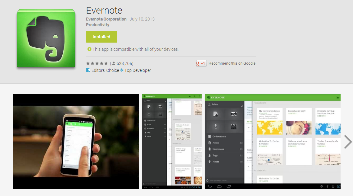

As far as what's gone, the ability to view apps installed by device appears to have been removed, and filtering reviews by star rating has vanished, as well (along with review pagination).
The devices page has also received an overhaul, and is looking pretty spiffy. Head over to play.google.com to check it out (may still be rolling out in some countries).
Google Launches New Version Of Web Play Store, Is Absolutely Stunning, Lightning-Fast, And Full Of Cards

While functionally there aren't a huge amount of changes, the visual difference is stark. Everything seems to flow naturally as one big page as you navigate around the store, as opposed to a bunch of individually loading pages. The result is that most pages on the Play Store now load much more quickly than they did on the old site (well, at least for us they do - your mileage may vary).

New features include full-sized screenshots for apps (screenshots are also now in WEBP format), and the ability to wishlist directly from the web store. The individual app pages are sporting an all new look that, while it requires more scrolling, is much easier to visually parse, and logically groups information into sections, rather than a bunch of columns and annoying varieties of font size.


As far as what's gone, the ability to view apps installed by device appears to have been removed, and filtering reviews by star rating has vanished, as well (along with review pagination).
The devices page has also received an overhaul, and is looking pretty spiffy. Head over to play.google.com to check it out (may still be rolling out in some countries).
Google Launches New Version Of Web Play Store, Is Absolutely Stunning, Lightning-Fast, And Full Of Cards
